The Definitive Windows 8 Review And User Guide
The new version of Windows is now available on store shelves, and we have the complete lowdown on Microsoft's latest operating system. Join us as we thoroughly dissect the Windows 8 UI (Metro), Apps, Desktop, Gestures, IE10, SkyDrive, and Windows Store.
Tom's Tips To Mitigate Windows 8 UI
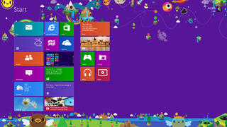
Yikes! If a screen like that doesn't exactly get you super-enthused about upgrading, we have some essential tips and tricks to get you back to the Windows experience you already know. The first three tips deconstruct the more radical elements of Windows 8, while the next three get us closer to a Windows 7-like environment.
Buy Local
This one is simple, and it actually cuts out a lot of what might bother enthusiasts about the Windows 8 UI. Using a local account instead of a Windows account means that you cannot use the Windows Store or any Windows UI 8 app not already pre-installed.
Exorcise the Demons
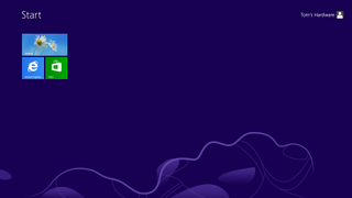
From there, the pursuit of cleanliness compels us to simply uninstall the Windows 8 UI apps that do make their way onto your hard drive by default. With the exception of the Windows Store (which can be un-pinned), all of the pre-installed apps can be uninstalled quite easily. Simply right-click on each tile and choose Uninstall from the App bar. By the time you're done removing everything, your Start screen goes from this...
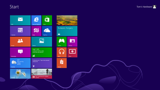
...to this.
Get Out Of My Way!
Stay On the Cutting Edge: Get the Tom's Hardware Newsletter
Get Tom's Hardware's best news and in-depth reviews, straight to your inbox.
If the Swticher gets in your way every time you jam the mouse into the top-left corner of the screen to hit Internet Explorer's back button or open an application's File menu, then get rid of it. Toggle "Allow switching between recent apps" to Off in the General page of the Windows 8 PC settings. This completely disables the Switcher. Now, only the Start tile appears from the lower-left corner.
Roll Your Own Start Screen
The Windows 8 Start screen doesn't have to drive you crazy. Once you're done eradicating every trace of Microsoft's Windows 8 UI apps, populate your Start screen with the desktop apps you're used to.

If you grew accustomed to hitting the Windows key to open the Start menu, and then conducting a search, you're in luck. This is still possible in Windows 8. Just hit the Windows key and begin typing, the Search Charm automatically kicks in.
Keyboard mavens accustomed to using the Windows key to navigate down a list of pinned applications in Windows 7 can do something similar here as well. Just hit the Windows key and use the arrows to select the tile you're after, then press Enter.
Even better, move the Desktop tile to the top of the first row of tiles. While the Desktop tile is most likely placed on the bottom of the first row by default in order to make it closer to the old Start button, moving it to the top has advantages. By occupying the top spot, pressing the Windows key and hitting Enter takes you right to the Desktop. You basically create a new keyboard shortcut simply by shuffling tiles around. The way tiles are laid out is entirely up to you, much like the pinned section of the old Start menu, so it should be easy to organize them for maximum convenience. This trick works for any app, but if you can't stand the Windows 8 UI, the Desktop app is a particularly appropriate choice for the top spot.
The Start screen is basically a giant board of pinned favorites. If you can get over a little bit of extra cursor distance, you may even find the Start screen to be an upgrade from the Start menu.
Treat The Taskbar Like a Dock
Pin all of your most-used apps to the taskbar. While Windows 95 through Vista separated app launchers from open windows in the taskbar, Windows 7 gave us a combined launcher/window dynamic, much like the Dock in OS X or Ubuntu's Unity Launcher. Those operating systems pre-load their docks chock full of application launchers, giving you the impression that that's how the dock is supposed to be used. In contrast, Windows 7 had a measly three applications in the taskbar by default.
If you truly want to avoid the Windows 8 UI at all costs, loading up the taskbar is probably your best bet.
Bring Back Desktop Icons
But don't stop there. Create some desktop shortcuts as well. Right-click on the desktop and choose Personalize. Then choose "Change desktop icons". Restore the old desktop icons for Computer, your user folder, Network, and Control Panel, since you lost handy access to them via the Start menu.
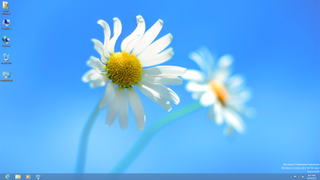
Now let's try jazzing up the aesthetic aspect a bit. Get rid of that purple theme and default background in the Windows 8 UI, replacing it with something a little cleaner. Black and red with gears; sure, that'll do. Now, change your Desktop personalization settings to a custom wallpaper and window color. Voila. There's something easier to stomach.
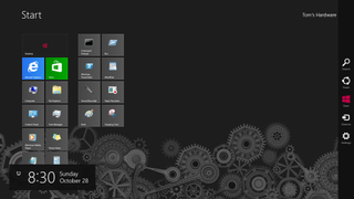

This is much closer to the Windows 7 that we knew. Plus we get the better File Explorer, Task Manager, File History, triple-Snap, and improved multi-monitor support through the Charms bar. After our sequence of simple tweaks, anyone who loathes the new tile-based user interface has to look at Windows 8 in a different light.
Current page: Tom's Tips To Mitigate Windows 8 UI
Prev Page World's Collide: Windows 8 UI + Desktop Next Page Windows 8: Mistake Or Misunderstood?-
deftonian decisions, decisions... part of me wants to upgrade, the other part is afraid there's no turning back. I'll keep reading reviews and eventually make the decision. However, thanks Tom's, and not for posting the review, but for not posting another apple article.... :)Reply -
mayankleoboy1 Adam, where are the UI performance improvement benchmarks ?Reply
Win8 is supposed to have everything GPU accelerated, to "better handle big texts" like MS-Word.
So how will you measure FPS in MS-Word ?Plus, how do you measure the 2D performance improvements, the much touted smoothness of win8 ? -
Upgraded to Windows 8 Pro yesterday for $15 on a brand new all in one computer I bought the same day and already, have lots of problems. A lot of my the software I had running on Windows 7 Ultimate worked fine and now don't work at all. The brand new computer I bought with the touch screen... well the touch screen doesn't work and the manufacturer has not driver update to fix it. I'm hoping this will change in time.Reply
-
jasonw223 Just bought 3 copies for my desktop / HTPC / wife's PC. There are quite a few haters out there - but I quite like it. I think if more people gave it a try (like the reviewer) that it would grow on them.Reply
Also, if anyone wants to buy my Transformer Prime, let me know lol. -
agnickolov I'm getting an upgrade copy for my wife's computer. She's struggling with Vista, so this should help I hope... (It better, she's getting a 128GB Samsung 830 as well.) For myself I'll likely stick with Windows 7 Ultimate.Reply -
DjEaZy agnickolovI'm getting an upgrade copy for my wife's computer. She's struggling with Vista, so this should help I hope... (It better, she's getting a 128GB Samsung 830 as well.) For myself I'll likely stick with Windows 7 Ultimate.... why you are torturing your wife... it's hardly an update from vista to 8... the one is slow but windows, the other is quick, but nothing like windows... be a good husband and get her Win7 too...Reply -
SteelCity1981 Without Aero the Windows in Windows 8 looks like something you would see in Windows Windows 9x which makes Windows 7 with Aero look more modern then Windows 8 without Aero. I would even say Windows XP's Luna Windows looks more modern then Windows 8 Windows.Reply
I gave Windows 8 a chance for months in its preview version and not much has changed since the preview version went to the RTM version and always found myself navigating back to Windows 7. I mean Windows 8 felt like an OS that had things i didn't want then an OS that had things I did want. I didn't want a Modern UI as my main screen. I didn't want MS to get rid of the start menu, I didn't want Aeroless Windows that looks like something you would see on Windows 9x. Sure there are programs like classic shell the helps ease the pain of not having a start menu, but that won't be a gurantee to always work esp if MS tries to block it from working with future update patches to Windows 8. And even if they don't patch it all i'm doing is trying to make Windows 8 look like Windows 7 so why don't just stick with Windows 7 instead if that's the case.
Now I think Windows 8 is great on touch screen devices, but for pc's it's another story. Which is why I always thought that MS should have made two diff versions of Windows 8 one for touch screens and one for non touch screens without the Modern UI and with a start menu. Those two simple changes would have made a lot more people that use anon touch screen pc more satisfied with Windows 8.
I read people on here saying people are haters of Windows 8, but those so called haters of Windows 8 reflect on reality off the frustration that most consumers will feel the first time they try to use Windows 8. I think what some of you are missing is the avg consumer that aren't tech savvy doesn't like a lot of change presented to them at once, because it took them a while to understand the Windows that they are using now and making a big change to that will generate almost instant frustration and this is where I feel MS is at a big disconnect with Windows 8 and the avg consumer who are vastly makeup the computer market and when you impose something that seems radical to them and what they have been soo used to for years, it's going to have a big negative effect on that product. -
JOSHSKORN Now that I think about it, I don't even use my Start Button. Everything I need, I have tucked away in quick launch. Very rarely do I find myself looking at my Start Button, unless I need the Control Panel.Reply
