The Definitive Windows 8 Review And User Guide
The new version of Windows is now available on store shelves, and we have the complete lowdown on Microsoft's latest operating system. Join us as we thoroughly dissect the Windows 8 UI (Metro), Apps, Desktop, Gestures, IE10, SkyDrive, and Windows Store.
Windows 8 UI Basics
The way in which you navigate the Windows 8 UI is completely different from any other version of Windows in history. Let's go over the major on-screen elements as well as basic control mechanics (arguably the most non-obvious aspect to Windows 8).
Navigating The Windows 8 UI
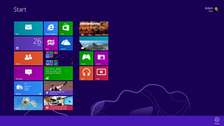
Since Windows 8 was designed with touch-based devices in mind, and a taskbar crams in too much information to be finger-friendly, the Windows 8 UI employs four different tool bars, one for each edge of the screen. The screenshot below is a map of the Windows 8 UI from the Start screen.
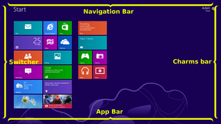
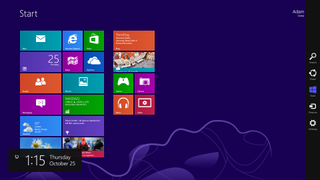
The right-hand bar is called the Charms bar. Below is a shot of the Windows 8 Start screen with the Charms bar active.
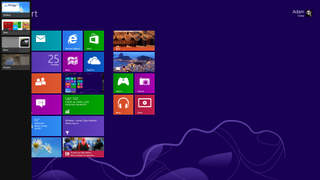
The bar that spawns from the left side of the screen is called the Switcher, and the following image is of the Windows 8 Start screen with the Switcher visible.
The bottom bar is called the App bar, and the screenshot below shows the App bar on the Windows 8 Start screen.
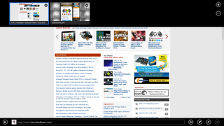
The last bar appears from up top and is called the Navigation bar. Only a few apps make use of the navigation bar, and it does not appear on the Start screen. The screenshot below is of the Navigation and App bars in Internet Explorer 10.
Stay On the Cutting Edge: Get the Tom's Hardware Newsletter
Get Tom's Hardware's best news and in-depth reviews, straight to your inbox.
Controlling The Windows 8 UI
There are no maximize or minimize buttons in the Windows 8 UI. Instead, the active window appears full-screen by default, and inactive applications are simply hidden from sight. This is very much how mobile operating systems like Google's Android, Apple's iOS, and HP's WebOS are organized.
That's not to say that Windows 8 takes us back to the dark ages of single-tasking. Rather, Windows 8 lets you Snap apps, somewhat similarly to Windows 7. In fact, window management (really, app management in Windows 8), is accomplished entirely through Snap. When you move the mouse cursor to the top of the screen in an app (including the Desktop), the familiar pointer becomes a hand.
You can Snap any app to either side of the screen. Unlike Aero Snap in Windows 7, Snap in the Windows 8 UI doesn't split the screen into equal halves. Instead, one app becomes a small sidebar, while the other monopolizes most of the screen.

Once an app is snapped, you can go back to the Start screen and open another app to populate what desktop real estate remains. Alternatively, you can also select an app that is already open from the Switcher on the left side of the screen.
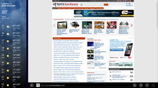
A thick vertical slider bar separates the two applications. Dragging the slider toward the larger window turns it into the sidebar-sized app, thereby enlarging the app that was previously the sidebar.
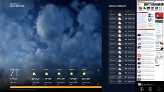
Moving the slider all of the way off either side of the screen causes the window occupying that side to disappear, and the other app returns to full-screen mode.
You can also take an app and swap it over to the other side of the screen by clicking and dragging it over. This swaps the position of two open applications, but does not change their size.
Finally, you close Windows 8 apps by dragging them down to the bottom of the screen. They'll resist at about the halfway point, but quickly accelerate once your cursor gets close to the bottom edge. Ostensibly, this is to reduce unintended closures on touchscreens. However, the action is more of an issue on some older-style trackpads. Successfully closing an app on Toshiba's Satellite S955 using double-tap and drag (not the physical buttons) is a challenge. The clickpad-equipped Toshiba Satellite P845t, on the other hand, was much easier to use.
Now that we're better-acquainted with the basics, let's dig deeper into the Windows 8 UI, starting with the, er, Start screen.
Current page: Windows 8 UI Basics
Prev Page Installing And Setting Up Windows 8 Next Page Windows 8 Start Screen-
deftonian decisions, decisions... part of me wants to upgrade, the other part is afraid there's no turning back. I'll keep reading reviews and eventually make the decision. However, thanks Tom's, and not for posting the review, but for not posting another apple article.... :)Reply -
mayankleoboy1 Adam, where are the UI performance improvement benchmarks ?Reply
Win8 is supposed to have everything GPU accelerated, to "better handle big texts" like MS-Word.
So how will you measure FPS in MS-Word ?Plus, how do you measure the 2D performance improvements, the much touted smoothness of win8 ? -
Upgraded to Windows 8 Pro yesterday for $15 on a brand new all in one computer I bought the same day and already, have lots of problems. A lot of my the software I had running on Windows 7 Ultimate worked fine and now don't work at all. The brand new computer I bought with the touch screen... well the touch screen doesn't work and the manufacturer has not driver update to fix it. I'm hoping this will change in time.Reply
-
jasonw223 Just bought 3 copies for my desktop / HTPC / wife's PC. There are quite a few haters out there - but I quite like it. I think if more people gave it a try (like the reviewer) that it would grow on them.Reply
Also, if anyone wants to buy my Transformer Prime, let me know lol. -
agnickolov I'm getting an upgrade copy for my wife's computer. She's struggling with Vista, so this should help I hope... (It better, she's getting a 128GB Samsung 830 as well.) For myself I'll likely stick with Windows 7 Ultimate.Reply -
DjEaZy agnickolovI'm getting an upgrade copy for my wife's computer. She's struggling with Vista, so this should help I hope... (It better, she's getting a 128GB Samsung 830 as well.) For myself I'll likely stick with Windows 7 Ultimate.... why you are torturing your wife... it's hardly an update from vista to 8... the one is slow but windows, the other is quick, but nothing like windows... be a good husband and get her Win7 too...Reply -
SteelCity1981 Without Aero the Windows in Windows 8 looks like something you would see in Windows Windows 9x which makes Windows 7 with Aero look more modern then Windows 8 without Aero. I would even say Windows XP's Luna Windows looks more modern then Windows 8 Windows.Reply
I gave Windows 8 a chance for months in its preview version and not much has changed since the preview version went to the RTM version and always found myself navigating back to Windows 7. I mean Windows 8 felt like an OS that had things i didn't want then an OS that had things I did want. I didn't want a Modern UI as my main screen. I didn't want MS to get rid of the start menu, I didn't want Aeroless Windows that looks like something you would see on Windows 9x. Sure there are programs like classic shell the helps ease the pain of not having a start menu, but that won't be a gurantee to always work esp if MS tries to block it from working with future update patches to Windows 8. And even if they don't patch it all i'm doing is trying to make Windows 8 look like Windows 7 so why don't just stick with Windows 7 instead if that's the case.
Now I think Windows 8 is great on touch screen devices, but for pc's it's another story. Which is why I always thought that MS should have made two diff versions of Windows 8 one for touch screens and one for non touch screens without the Modern UI and with a start menu. Those two simple changes would have made a lot more people that use anon touch screen pc more satisfied with Windows 8.
I read people on here saying people are haters of Windows 8, but those so called haters of Windows 8 reflect on reality off the frustration that most consumers will feel the first time they try to use Windows 8. I think what some of you are missing is the avg consumer that aren't tech savvy doesn't like a lot of change presented to them at once, because it took them a while to understand the Windows that they are using now and making a big change to that will generate almost instant frustration and this is where I feel MS is at a big disconnect with Windows 8 and the avg consumer who are vastly makeup the computer market and when you impose something that seems radical to them and what they have been soo used to for years, it's going to have a big negative effect on that product. -
JOSHSKORN Now that I think about it, I don't even use my Start Button. Everything I need, I have tucked away in quick launch. Very rarely do I find myself looking at my Start Button, unless I need the Control Panel.Reply
