Windows 8 Consumer Preview Hits 1 Million Downloads
The Windows 8 Consumer Preview wasted no time hitting the first big milestone.
Get Tom's Hardware's best news and in-depth reviews, straight to your inbox.
You are now subscribed
Your newsletter sign-up was successful
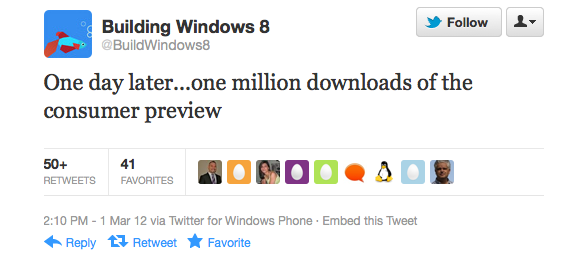
It's been just two days since Microsoft released the Windows 8 Consumer Preview for download but already the software has reached a huge milestone. The Microsoft Windows 8 Build team on Thursday afternoon announced that they had seen one million downloads of the consumer preview after only one day.
Windows 8 Consumer Preview launched on Wednesday morning, approximately six months after the Developer Preview was released in September of 2011 at BUILD. Windows 8 is a notable departure from Windows 7 in that it includes the Metro UI, which most people will recognize from Windows Phone 7. The famous Start button has also been removed and Microsoft has replaced this iconic Windows feature with a sort of hotspot in the bottom left corner. Windows 8 also includes the ability to sign in via Windows Live, and the Windows Store, which is similar to the Mac App Store.
Follow @JaneMcEntegart on Twitter.
Article continues belowGet Tom's Hardware's best news and in-depth reviews, straight to your inbox.

Jane McEntegart is a writer, editor, and marketing communications professional with 17 years of experience in the technology industry. She has written about a wide range of technology topics, including smartphones, tablets, and game consoles. Her articles have been published in Tom's Guide, Tom's Hardware, MobileSyrup, and Edge Up.
-
upgrade_1977 Haven't downloaded it yet, no time. Probably download it sunday and try it then.Reply
olafgood for them ... so far not loveing it ...
Just for informative purpose's, what are the reason's why your "not loving it"?
-
wolley74 upgrade_1977Haven't downloaded it yet, no time. Probably download it sunday and try it then. Just for informative purpose's, what are the reason's why your "not loving it"?Reply
pain to navigate, no start menu / desktop / task manager is a pain to use... it's just horrible -
nbelote Wolley74pain to navigate, no start menu / desktop / task manager is a pain to use... it's just horribleReply
The desktop is there and it's fine. No Start menu? Right click the lower left hand corner, a ton of functions are there and if I can't find something I can start typing in Metro and it shows up immediately. The new task manager is also quite handy. From a sysadmin point of view I like the new server management console that's installable, it's very feature-rich in comparison to the tools provided for Vista and 7.
Problems? I have none. Accepting that it's the future of Windows is the first step. Using your brain and understanding what's there versus what you need to do is the next. -
hotroderx I am not sure I will be in the minority on this but I cant stand the Metro Desktop. I just find it extremely hard to navigate and use. We have used the same basic system of desktop navigation since 1995. I dont understand why after all these years it needs to be changed. Glaring example of how Windows 8 is much harder to navigate is as follows (unless I am missing something) lets open the C: Drive.Reply
First: Open the Metro Window by going to the bottom left hand corner (far corner) and highlighting the small indent. This will pop up a window that will allow us to access metro window.
Second: We need to right click any where in the metro Window where there is nothing that will open a bar at the bottom that allows us to click all apps
Third Once all Apps has been accessed we have to click on Computer which will then exit metro taking us to the desktop with our drives showing.
All this for something that should be as simple as double clicking the My computer icon on the desktop.
This system might work great on a touch screen or on a tablet but I just don't see it working that great for the average user.
Personally I will stick with my Windows 7 unless Windows 8 is given a proper start button or the option to setup a proper start button. Worse case might have to look into going Linux if Windows truly does adopt this new interface access system and continues it down the road. -
jdog2pt0 I will be skipping Win8 as long as possible and here's why. The current trend is mobile devices, and the problem is that everyone seems to focus on that now, instead of the traditional desktop experience. They seem to forget that PC's still exist. The Windows tile interface is useless to PC users. Ubuntu is going the same path. Unity sucks and HUD is bullshit. Here soon I will be switching to Mint. It's sucks, and I'm not going to encourage it.Reply
For clarification I use Win7 on my desktop, and Ubuntu on my laptop (my main computer) -
masterofevil22 It's "interesting"...Reply
I realize this is not the final build, but so far I'm planning on sticking with W7. If I get a windows phone ever (doubtful, GSII ftw..) maybe I'll use it for sync with the next xbox or something, but it's definitely wierd. -
jdwii You can get to my computer by right clicking on the bottom left corner of the screen and clicking on windows explorer!Reply
