Dell's New Look Logo That You May Never Notice
Dude, you're getting a new logo!
Get Tom's Hardware's best news and in-depth reviews, straight to your inbox.
You are now subscribed
Your newsletter sign-up was successful
You've probably already seen it a dozen times, but you may not have noticed it. Dell is sporting a new logo, and it despite the fact that the changes were minor over the old one, the company likely spent a considerable amount of marketing resources in making it.
What you see below are the various versions of its previous logo. It's essentially the same old Dell logo but in different settings.
And here is the new logo that's already been phased into the company's website and other branding.
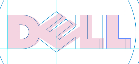
The differences are so subtle that they are almost imperceptible without a direct comparison over the older design. The lines of the new logo are in blue, overlaid on the old logo in pink.
First of all, Dell worked with a font type to tailor a typeface, Museo, specifically for the logo. It did keep the iconic tilted 'E' which is critical to the logo, and added in additional vertical height to the letter. Dell also packed its characters closer together and encased it permanently inside a circle.
While a logo change, especially one as subtle as this, won't really change how its machines are built of what cool feature may make it into the next XPS line, it's an interesting thing to take notice for a logo that we see so often both online and in the print advertisements that make it into our mailbox.
Source: Brand New
Get Tom's Hardware's best news and in-depth reviews, straight to your inbox.
-
Emperus The blue and white color scheming looks kindda Intel.. Wonder where is the creativity.?Reply -
chickenhoagie its kind of funny cuz it looks exactly like their old XP recovery CD's..not original at all. The black one was definitely betterReply -
NightLight FIRE the man who made this! I mean COME ON! I can use paint to recreate this in seconds!Reply -
malphas Still looks incredibly early 90's, and conjures up all the images associated with that time - beige boxes, basic GUIs, command prompts, etc.Reply
I can't help but think of Dell as a producer of ugly, low-spec family PCs rather than something I'd actually consider buying, even though that's not really the case anymore with the XPS line. They should consider revamping their entire brand image as well as just the logo - and more dramatically than this. -
dextermat Dell still is low quality & bad costumer suppoert to me... don't buy any of their product.Reply
So many of the laptops turns out to die after waranty and most of the pentium 4 tower has big problems because of low quality product just after a few years. -
FATAL STR1K3 malphasStill looks incredibly early 90's, and conjures up all the images associated with that time - beige boxes, basic GUIs, command prompts, etc.I can't help but think of Dell as a producer of ugly, low-spec family PCs rather than something I'd actually consider buying, even though that's not really the case anymore with the XPS line. They should consider revamping their entire brand image as well as just the logo - and more dramatically than this.ditto. I have an xps which was great. I upgraded the gpu and psu about two years after having it but I think they just need to look more modern. Not so much their products, but their image for sure.Reply


