Display Calibration 201: The Science Behind Tuning Your Monitor
Gamut: What Color Is Your Monitor?
If you read the explanations of color gamut in our monitor reviews, or in Display Calibration 101: Step-By-Step With Datacolor's Spyder4Elite, then you know that color gamut is another standard by which displays are matched to each other, as well as to cameras and printers. While it is possible to have a screen with a built-in color management system, it’s far more common to create a look-up table, called an ICC profile, that reconciles differences between a monitor’s actual color gamut and the target values.
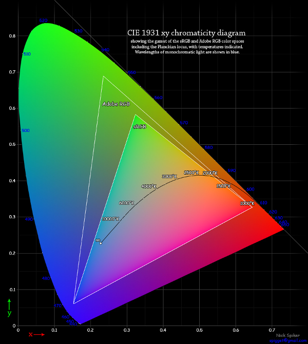
Below we have a different representation of the CIE chart.
We chose this one because it shows the two gamuts currently available on computer monitors: Adobe RGB 1998 and sRGB. As you can see in the graphics, they are subsets of the full chart, which portrays the spectrum of color visible to the human eye. How close a display comes to these gamuts is a very important part of our testing.
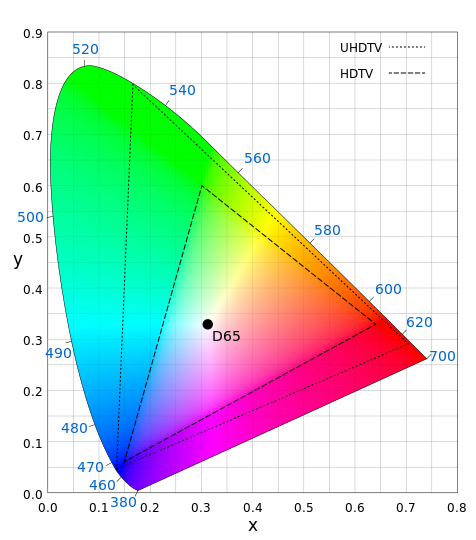
There are other standards besides these two. The most common one is Rec. 709, which is used by high-definition televisions and projectors. Why don’t we show it on the chart? Because it’s identical to sRGB. They are indeed interchangeable. The other standard we’ll mention briefly is Rec. 2020, which is still a proposed spec and not currently in use on any production displays.
This is the proposed color gamut for ultra-high definition screens at both 4K and 8K resolutions. When this gamut is actually used in a monitor, you’ll need appropriate content to match it. And that is unlikely to happen without major upgrades in optical disc storage capacity and bandwidth, since it requires a minimum of 30 bits per pixel to encode.
How does this apply to our discussion? All fixed-pixel displays use three primary colors, red, green, and blue, to display an image. In the case of an eight-bit panel, 2563 gives us a possible 16,777,216 colors. Obviously, the positions of those primaries on the CIE chart are of paramount importance. Assuming that the camera used conforms to the standard, the only way we’ll see the same image is if our monitor conforms to the same standard.
That’s simple enough to understand, but what about the secondary colors?
Get Tom's Hardware's best news and in-depth reviews, straight to your inbox.
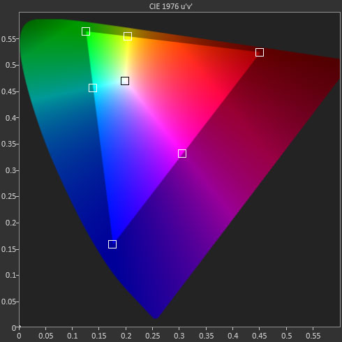
In between the primary color points are the secondary ones: cyan, magenta, yellow. These are created by mixing two of the primaries in a particular ratio. The technical term is phasing and it’s important that a display does this correctly. A screen can have spot-on primaries, however, if the secondaries are off, visible color errors will result. Previously, we saw that adjusting the white point can help align secondaries. And most of the time, this is the only thing we can do to improve a display’s color accuracy.
Now we’ll get into some actual application of all this science. We’re going to explain just how we calibrate a monitor using its built-in controls only. This is exactly what we do for our reviews.
Current page: Gamut: What Color Is Your Monitor?
Prev Page Grayscale: Why White Is The Color Of Everything Next Page Application: How To Adjust Levels
Christian Eberle is a Contributing Editor for Tom's Hardware US. He's a veteran reviewer of A/V equipment, specializing in monitors. Christian began his obsession with tech when he built his first PC in 1991, a 286 running DOS 3.0 at a blazing 12MHz. In 2006, he undertook training from the Imaging Science Foundation in video calibration and testing and thus started a passion for precise imaging that persists to this day. He is also a professional musician with a degree from the New England Conservatory as a classical bassoonist which he used to good effect as a performer with the West Point Army Band from 1987 to 2013. He enjoys watching movies and listening to high-end audio in his custom-built home theater and can be seen riding trails near his home on a race-ready ICE VTX recumbent trike. Christian enjoys the endless summer in Florida where he lives with his wife and Chihuahua and plays with orchestras around the state.
-
MANOFKRYPTONAK For TVs CNET posts the color levels they use to test each TVs picture by model. They also give great advice on how to adjust too! I used there settings with my 50" vizio and could not be happier. Don't get me wrong loved this article, but you can never get too much info, am I right?Reply -
yolosweg I've adjusted the gamma on my laptop but it keeps reseting. Does anyone know how to fix this? (I used the default windows program btw)Reply -
Vladimir83 Fantastic article.....TomsHardware style!Reply
I have no idea how my monitor was off until i saw the patterns ;)
Now perfectly set for brightness/contrast:first,third,and fourth pattern(although on this i notice cliping on the blue).
However second pattern couldn't set it right.Darkest bar which should be almost cliping to the background is too "black",and the next "12" bar is more closely match to the background in colour.
Any thoughts someone? I use Philips 227Eqha IPS monitor. -
rezzahd Great display calibration guide. I would recommend this to anyone new to display calibration.Reply -
clonazepam Every time I took a support call for pro graphics products, and it centered around getting accurate color, I started off with "Color is a 3-dimensional space..." It was just my way of saying we might be here for awhile.Reply
I love these articles. =) -
ojas Second page, second last photo, article should say that you've set the black level too low, not too high.Reply
Seems to be an interesting read so far, and I've really wanted to read an article like this, so thanks in advance! -
ojas Doesn't the first picture of Gavin on the 3rd page have low gamma and the second bright one is where the gamma is too high?Reply
It's written the other (incorrect?) way around in the article, i think. -
ojas ReplyNow we’ll make the color temp too warm; in other words, below D65.
Shouldn't it be "above D65"? :/ -
gwolfman Reply
It's opposite. Lower gamma makes the dark areas of an image brighter, hence the entire picture looks brighter. Higher gamma makes the lighter areas darker (i.e., it takes a lot brighter white in the image data to actually be displayed white). Check here for a great tutorial on gamma, especially the section titled "Display Gamma."11718866 said:Doesn't the first picture of Gavin on the 3rd page have low gamma and the second bright one is where the gamma is too high?
It's written the other (incorrect?) way around in the article, i think.
http://www.cambridgeincolour.com/tutorials/gamma-correction.htm
That's incorrect. It actually works backwards/opposite from what one might think. Color temperature originates from the color a flame radiates in relation to the temperature at which it burns. Think back to grade school and playing with the Bunsen burner... the hottest part of the flame (i.e., higher Kelvin) is in the darkest blues, not the reds (i.e, lower temperature/Kelvin). This simple picture helps explain the difference.11719001 said:Now we’ll make the color temp too warm; in other words, below D65.
Shouldn't it be "above D65"? :/


