Display Calibration 201: The Science Behind Tuning Your Monitor
Application: How To Adjust Levels
Hopefully, all of this talk of science and theory is inspiring you to try calibrating your own display. If you have the basic tools available, you can do this by following the steps we’ll outline in the next four pages. As stated in the beginning, you’ll be adjusting the monitor’s controls only. This method does not use a software look-up table. You can also create an ICC profile for use with your graphics apps. We’ll show you how on page nine.
We suggest you follow the steps here in the order we give them. Since there are nearly always interactions between controls, this procedure minimizes the need to go back and forth to dial in your display.
First, you should go through a little pre-flight drill.
- Warm up your monitor for at least 30 minutes before you start. That way, the backlight will be stable and you’ll get the most accurate measurements.
- Find a picture mode that is neither too bright nor too dark. Usually one marked Standard is a good bet.
- Set the Color Temp to User or Custom so you have access to the RGB sliders.
- If there is a Gamma preset, choose 2.2.
- Now you’re ready to begin.
First up are the level adjustments; Brightness and Contrast. These can be set by using a couple of test patterns. There are many available that will work. Here are a couple of samples.
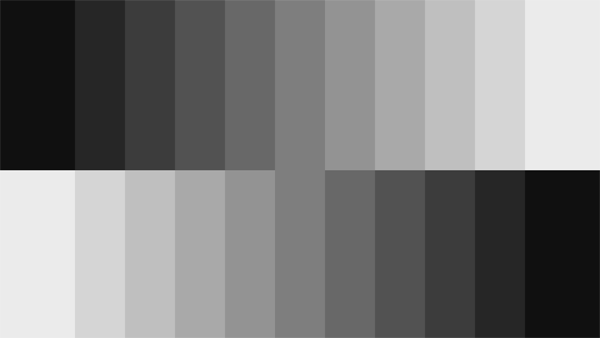
This is one of the grayscale step patterns generated by our Accupel. You can also find this pattern online. In fact, we downloaded this very graphic. You should see 11 brightness steps. Fifty percent is in the middle.
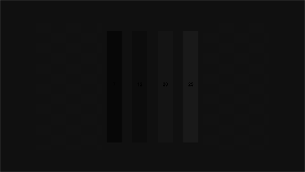
Here is a PLUGE pattern.
PLUGE is a traditional term for patterns used to set levels. The acronym stands for Picture Line Up Generating Equipment. Definitely a throwback to the analog era! You should be able to see four vertical bars in the center of the field. They start with the darkest on the left and become brighter as you go right.
Get Tom's Hardware's best news and in-depth reviews, straight to your inbox.
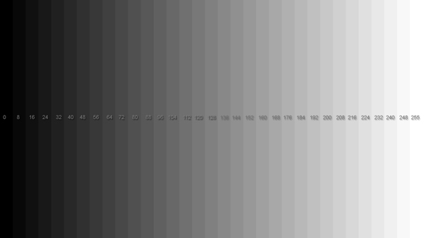
This pattern is good for setting contrast.
We’ll explain how to use all of these patterns in a moment. The important part is the section on the right side. There are a total of 33 bars ranging from 0 to 100 percent, or in RGB terms, 0 to 255.
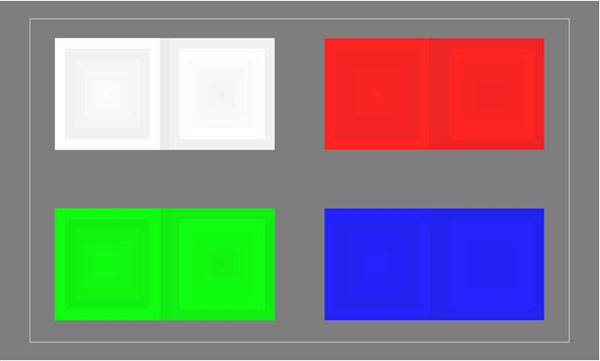
Finally, we have another pattern that’s even better for setting contrast.
In this pattern, you should see eight concentric squares that vary in brightness. If you can’t see all eight squares, that color is clipping.
The common theme in all of the patterns is that they have bars a few brightness steps apart from one another. By viewing these bars, it’s easy to see when you’ve set the controls too far in one direction because one or more of them blend together. This is what we mean when we use the term clipping.
Start with the first pattern, the grayscale steps. Lower the Brightness control until the darkest two bars become one. On most monitors, they’ll never actually blend because they’re quite far apart in brightness.
Now try the same exercise with the second pattern. On some monitors, the darkest bar will disappear. When this happens, turn Brightness back up until the bar is just visible. If you can turn your Brightness control all the way down without clipping any bars, then you should set the control with a meter instead. Display a 100 percent window pattern like this one.
Measure the window with your meter and adjust brightness until it’s at the value you want. We always use 200 cd/m2 but your preference may vary based on your room lighting conditions.
Now display the third pattern. Raise the Contrast control until the rightmost two bars blend together. That’s your clipping point. If you can raise it all the way and the bars are still visible, try the fourth pattern with the colored squares. This one is more precise because you can see the clipping point of each primary color. If one color clips, you’ll lose grayscale accuracy because the monitor has literally “run out” of that color. We’ve noted in all our monitor reviews that the Contrast control’s default setting is usually at its highest possible point. Raising it even one click often clips at least one color and sometimes all of them.
This is pretty easy to do, even without a meter. Most monitors will let you set the brightness anywhere in their range without clipping blacks. You just have to decide how bright you want your screen to be for your particular workspace. And contrast is generally fine at its default setting.
Since the final values of your level adjustments determine the measurement parameters for gamma, it’s important to do this step first. As we’ve already demonstrated, poor gamma has an obvious negative impact on image quality.
Current page: Application: How To Adjust Levels
Prev Page Gamut: What Color Is Your Monitor? Next Page Application: How To Adjust Gamma
Christian Eberle is a Contributing Editor for Tom's Hardware US. He's a veteran reviewer of A/V equipment, specializing in monitors. Christian began his obsession with tech when he built his first PC in 1991, a 286 running DOS 3.0 at a blazing 12MHz. In 2006, he undertook training from the Imaging Science Foundation in video calibration and testing and thus started a passion for precise imaging that persists to this day. He is also a professional musician with a degree from the New England Conservatory as a classical bassoonist which he used to good effect as a performer with the West Point Army Band from 1987 to 2013. He enjoys watching movies and listening to high-end audio in his custom-built home theater and can be seen riding trails near his home on a race-ready ICE VTX recumbent trike. Christian enjoys the endless summer in Florida where he lives with his wife and Chihuahua and plays with orchestras around the state.
-
MANOFKRYPTONAK For TVs CNET posts the color levels they use to test each TVs picture by model. They also give great advice on how to adjust too! I used there settings with my 50" vizio and could not be happier. Don't get me wrong loved this article, but you can never get too much info, am I right?Reply -
yolosweg I've adjusted the gamma on my laptop but it keeps reseting. Does anyone know how to fix this? (I used the default windows program btw)Reply -
Vladimir83 Fantastic article.....TomsHardware style!Reply
I have no idea how my monitor was off until i saw the patterns ;)
Now perfectly set for brightness/contrast:first,third,and fourth pattern(although on this i notice cliping on the blue).
However second pattern couldn't set it right.Darkest bar which should be almost cliping to the background is too "black",and the next "12" bar is more closely match to the background in colour.
Any thoughts someone? I use Philips 227Eqha IPS monitor. -
rezzahd Great display calibration guide. I would recommend this to anyone new to display calibration.Reply -
clonazepam Every time I took a support call for pro graphics products, and it centered around getting accurate color, I started off with "Color is a 3-dimensional space..." It was just my way of saying we might be here for awhile.Reply
I love these articles. =) -
ojas Second page, second last photo, article should say that you've set the black level too low, not too high.Reply
Seems to be an interesting read so far, and I've really wanted to read an article like this, so thanks in advance! -
ojas Doesn't the first picture of Gavin on the 3rd page have low gamma and the second bright one is where the gamma is too high?Reply
It's written the other (incorrect?) way around in the article, i think. -
ojas ReplyNow we’ll make the color temp too warm; in other words, below D65.
Shouldn't it be "above D65"? :/ -
gwolfman Reply
It's opposite. Lower gamma makes the dark areas of an image brighter, hence the entire picture looks brighter. Higher gamma makes the lighter areas darker (i.e., it takes a lot brighter white in the image data to actually be displayed white). Check here for a great tutorial on gamma, especially the section titled "Display Gamma."11718866 said:Doesn't the first picture of Gavin on the 3rd page have low gamma and the second bright one is where the gamma is too high?
It's written the other (incorrect?) way around in the article, i think.
http://www.cambridgeincolour.com/tutorials/gamma-correction.htm
That's incorrect. It actually works backwards/opposite from what one might think. Color temperature originates from the color a flame radiates in relation to the temperature at which it burns. Think back to grade school and playing with the Bunsen burner... the hottest part of the flame (i.e., higher Kelvin) is in the darkest blues, not the reds (i.e, lower temperature/Kelvin). This simple picture helps explain the difference.11719001 said:Now we’ll make the color temp too warm; in other words, below D65.
Shouldn't it be "above D65"? :/


