19" LCD Monitors: The Spring 2006 Collection
Get Tom's Hardware's best news and in-depth reviews, straight to your inbox.
You are now subscribed
Your newsletter sign-up was successful
Hyundai Q90U's Pitfalls
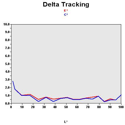
We tested the Hyundai Q90U's 3-ms panel with the calibrator, and we weren't very impressed. The Q90U is aimed at gamers, but that shouldn't serve as an excuse for ignoring color standards.
As a reminder, this graph shows the difference between the desired color shade and the one actually displayed.
- If DeltaE >3, the color displayed is significantly different from the theoretical one, meaning that the difference will be perceptible to the viewer.
- If DeltaE <2, LaCie considers the calibration a success, with a slight difference remaining, but one that will be all but undetectable to the user.
- If DeltaE < 1, color fidelity is excellent.
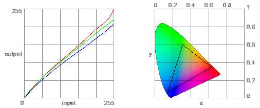
- If you have a calibrator you'll be able to compensate, but if not, you'll have to settle for an sRGB standard at 7200K. That's extremely cold for a factory adjustment.
| Black spot | White spot | Contrast |
|---|---|---|
| 0.3 | 172.2 | 574: 1 |
The black level was very good, and the brightness wasn't excessive. LCD monitor manufacturers usually choose a high brightness setting to catch potential buyers' eyes in the store. So score a point for Hyundai here. In addition, the contrast was quite respectable, though some competitors do better. But that's another chapter.
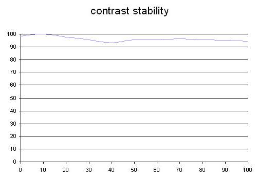
The contrast also showed very good stability on this model. This monitor got optimum results at low brightness.
This curve indicates the contrast value measured at a given brightness adjustment on the OSD. In theory, brightness and contrast are two independent parameters, and good contrast is a requirement regardless of the brightness adjustment. Unfortunately, such is not the case in practice. The brightness adjustment is shown on the X-axis, contrast on the Y-axis. Contrast is expressed here as a percentage of the maximum value measured using the ANSI test protocol.
Tested with the Gretag Eye-One Display 2, the Q90U revealed very good color richness. But as you can see, it was a little short in the red area, which is the result of a color adjustment that's a little too cold.
The color gamut represents the richness of the colors displayed. The corners of the triangle are the primary colors (in additive synthesis, of course). The surface of the triangle represents all colors that are displayable by combining the three primary colors with more or less intensity for each. So the greater the area of the triangle, the richer the colors.
Get Tom's Hardware's best news and in-depth reviews, straight to your inbox.


