Windows 11 at Launch: You Don't Need to Upgrade Yet
A nice redesign, but some productivity features need work.

Get Tom's Hardware's best news and in-depth reviews, straight to your inbox.
You are now subscribed
Your newsletter sign-up was successful
Back in 2015, the idea of Windows 11 seemed crazy. Windows 10 released that summer, and it certainly appeared that Microsoft was moving to an update-only approach. But six years later, Windows 11 is here with a fresh coat of paint that is sure to be divisive.
Windows 11 is an attempt at modernizing Windows for an era where more people work from home (or in a hybrid model). It's one that aims to work across form factors, whether you’re on a touch-centric device or one that’s keyboard and mouse only. . It's a design that hopes to capitalize on the resurgence of the PC as people purchase more of them to be productive wherever they are.
At this point, you're likely one of five people:
- You're in the Windows Insider program, and you've been using some form of Windows 11 for the past few months.
- You've seen the redesign, and have decided you're staying on Windows 10 until you get a new device.
- Your hardware doesn't qualify for Windows 11 anyway, so you're staying on Windows 10 until you upgrade. Or you're trying to bypass Windows 11's TPM requirement.
- You don't mess with betas, and are eager to upgrade to Windows 11 now.
- You didn't realize Windows 11 was coming. In which case, welcome! We have a lot to discuss.
Microsoft has already committed to supporting Windows 10 through October 14, 2025. That's a long time! It's getting a new feature update, 21H2, later this year with WP3 standards for Wi-Fi security and GPU compute support in the Windows subsystem for Linux, among other features. Going forward, most of the Windows 10 updates will be security patches rather than new features.
Article continues belowThe continued Windows 10 support provides an opportunity for people to decide, at least for a while, whether they really want to upgrade. However, soon, when you buy a prebuilt PC or laptop, it will have Windows 11 preloaded.
A New Look, a Worse Taskbar
Perhaps the most divisive part of Windows 11 is that there's a new look. As a whole, it works much like Windows 10 does. It's prettier and more modern with rounded corners and various levels of transparency.
Much of this comes from Windows 10X, which Microsoft meant to run on foldables and dual-screen devices, before it was moved to laptops and then mothballed altogether. Then, it became the seed for Windows 11. In some cases, it looks and feels great.
But then there's the taskbar.
Yes, the icons on the taskbar, including start, are centered. But don't panic. If you're a purist, you can move it to the left corner, where the start menu has historically lived.


The centering makes sense in some cases. Specifically, for convertible or detachable laptops with a tablet mode, where it simply feels normal. In touch-first modes, the Windows 11 creates more space between icons on the taskbar, making it better for touch.
Get Tom's Hardware's best news and in-depth reviews, straight to your inbox.
But otherwise, the taskbar is a large downgrade. So much functionality is gone. For many, the biggest issue will be that the taskbar has to live on the bottom or be hidden. You can no longer move it to the sides or top of the screen, using official methods, though there’s a buggy way to move the Windows 11 taskbar to the top.. Its height, too, is fixed, though there is a registry tweak that will let you choose from small, medium or large Windows 11 taskbar icons. The context menu on the taskbar (when you right click it) has been largely reduced to Taskbar settings.
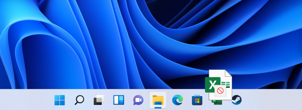
You can no longer drag files from your desktop or file explorer onto an app on the taskbar. If you do, you'll be greeted with the universal sign for "no" over the file. Windows 10 lets you do this, as does macOS. It's a pretty big loss.
You now have to open a menu to search, as the box has been taken off of the start menu. As someone who uses PowerToys or presses the Windows key to search in the Start menu, I didn't find this to be a huge deal, though some will surely miss the option.
Many other customization options -- like the ability to ungroup icons -- are also gone, and you have to dive deeper to remove certain system icons. Also, if you're using multiple monitors, the time will only show on the main one. It's a little issue, but I want to be able to check that information no matter which monitor I'm looking at.
Microsoft Teams is now directly integrated into the taskbar. If you use Teams, this may be a useful addition. To more instantly chat or video call. Otherwise, you can remove it from the taskbar altogether.
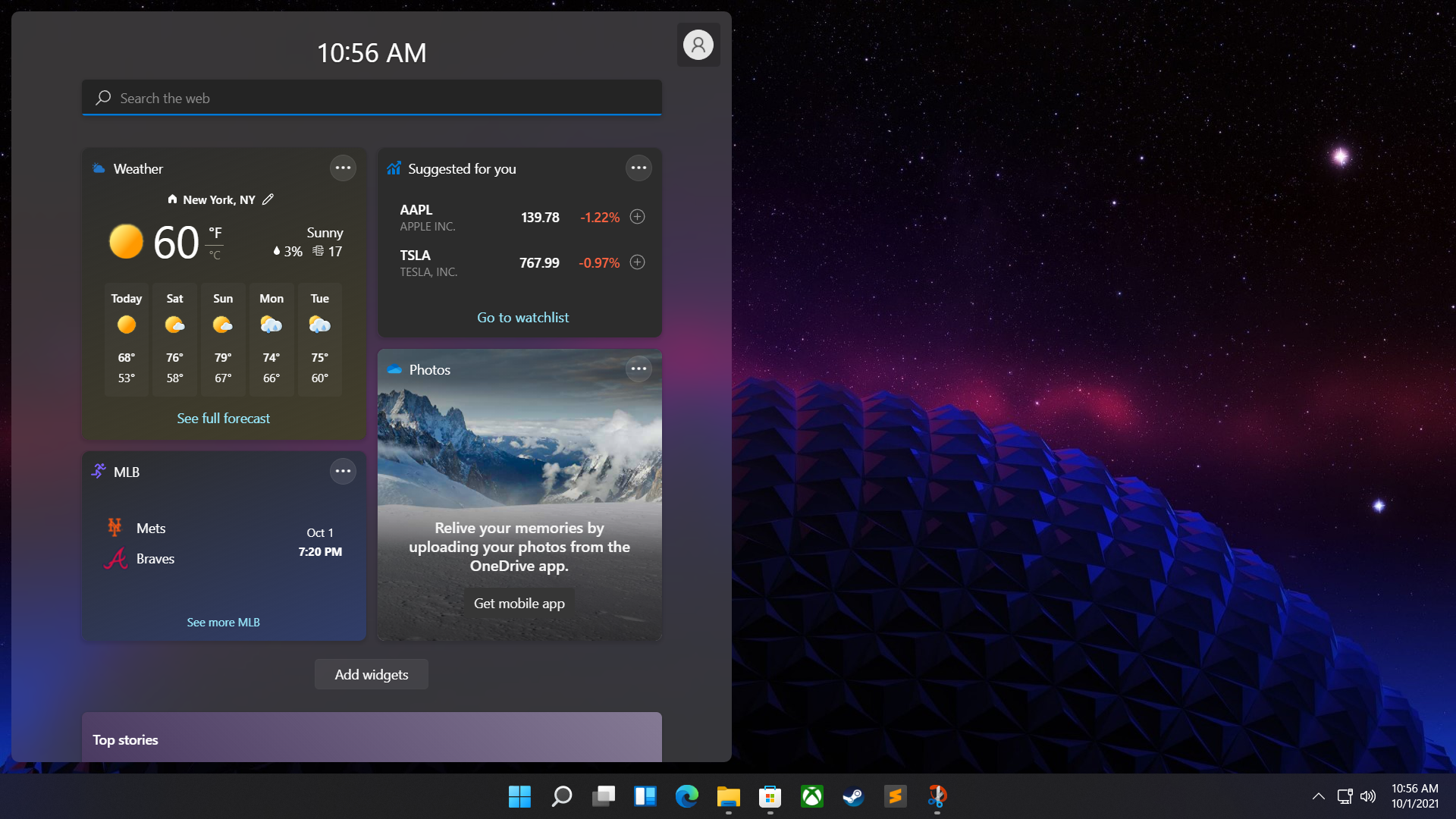
Widgets take a step forward from where they were in Windows 10, showcasing the weather and other information it thinks is important to you. As of this writing, while it looks nicer, I don't find them that much more useful. I'm hoping that eventually Microsoft allows third party widgets, which might actually drive me to use this.
For now, it largely feels like a nicer-looking MSN homepage. And if you do click those stories in Widgets, they will take you to Microsoft Edge, even you have a different browser set as your default.
Oddly, there's a search bar in Widgets, which is different from the search in the Start Menu and in the Search app. This one only searches the web, as opposed to the others, which search your entire computer.
Restarting Start
The Start menu, too, will be divisive. Rather than bringing you to a list of all of the software on your system, you can pin the ones you use most and access "recommended" files that you have recently worked on. Search is still built-in. Like the taskbar, this makes more sense on touch-based devices but hasn't translated well for those who use Windows exclusively on their desktops.
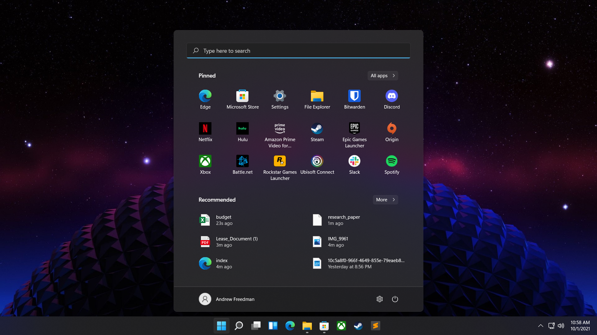
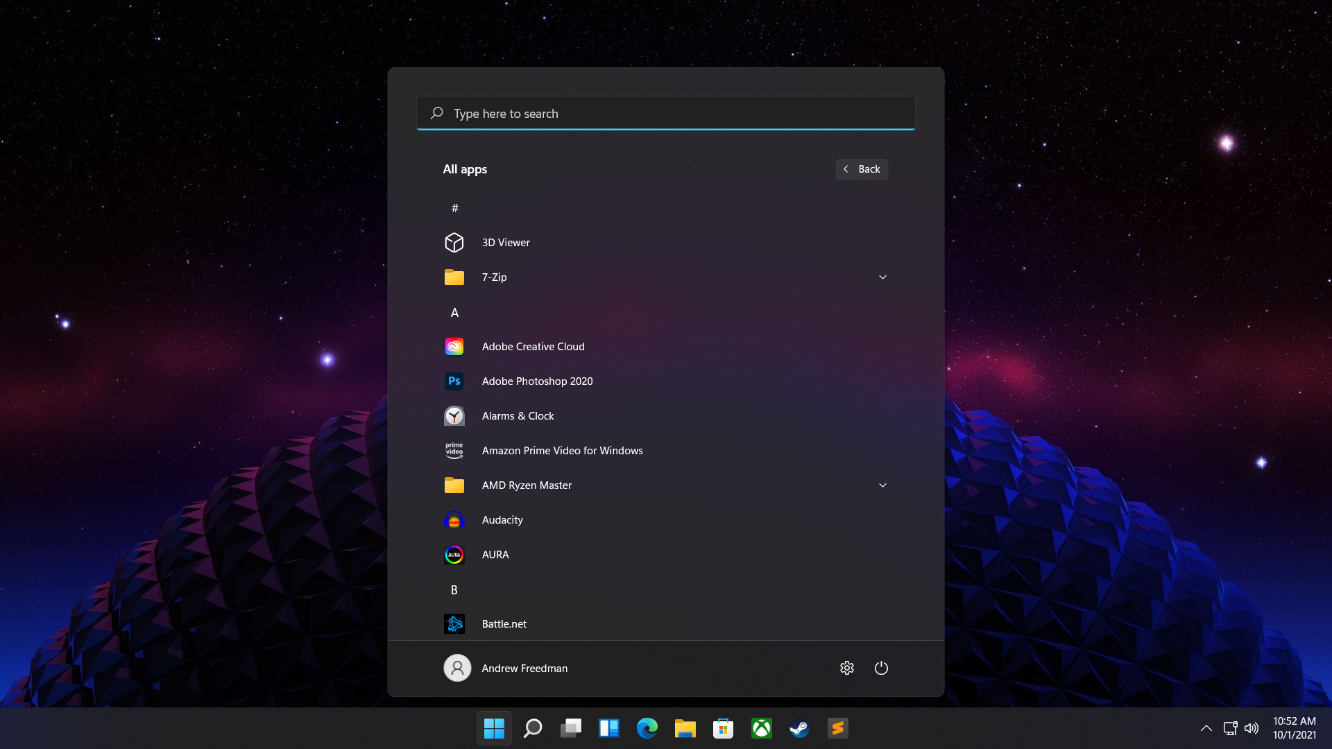
If you want to see every program, there's an extra click. For some of my colleagues, this is almost a dealbreaker. Personally, I'm a fan of searching for programs using PowerToys, so it's less of an issue. Additionally, I've seen and heard complaints that the new Start menu is simply too big, taking up valuable screen real estate. I've even heard it likened to Windows 8’s Start Screen, transporting you away from your work to open apps, though I think that's a bit extreme.
Out of Sight, Out of Context
Another power-user issue are the new context menus on the desktop. These menus look great, with a semi-transparent design, rounded corners and slick, clear new icons. There's also less information than before. Most context menus feature a "Show more options" selection, which brings up the Windows 10 menus you're used to, Again, this is extra work to see what used to already be there.
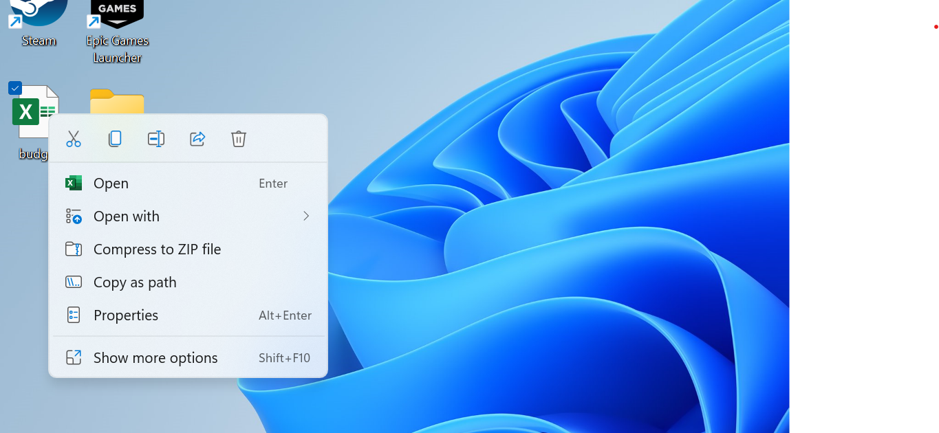
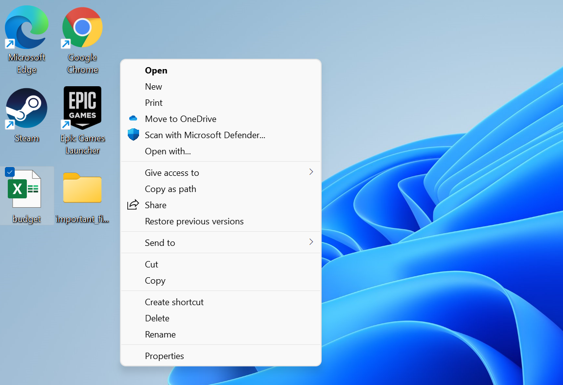
There are some benefits. The most common commands are all still there, and in many cases grouped together in ways that make more sense (why weren't Open and Open With" together before?). There are also some neat icons on top for some commands, like renaming, copying or deleting files, though you'll have to get used to what those mean.
Settings, File Explorer Get Modern
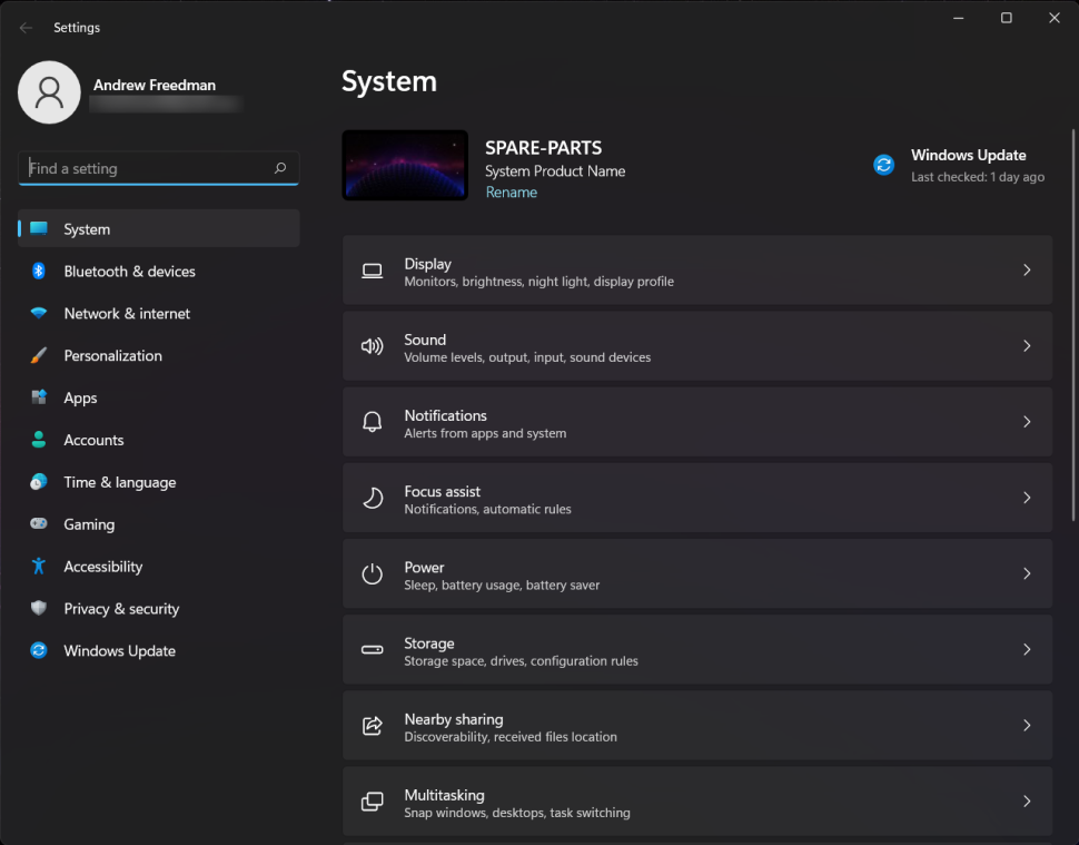
Some of the redesigned features are welcome. Among them are the new look of the Settings, app which has a much-needed overhaul, and subtle changes to Explorer.
For some, Settings has never replaced the Control Panel. Those people will never be happy. Luckily for them, Control Panel is still accessible in Windows 11.
For everyone else, Settings looks clean and fresh. The navigation is smoother and it's easier to move between subcategories in a sidebar and a series of simple breadcrumbs to see where you are in the navigation system.
Sound has its own dedicated changes, separating speakers and microphones and providing better controls for both.
There are also a handful of quality-of-life changes, like making it easy to change your PC's name, and, crucially, estimates of how long updates will take.
The File Explorer also has a cleaner look, though it's still largely the same as it was in Windows 10. It has increased spacing, for one, but the biggest change is that the ribbon menu you may be used to from Windows 10 now focuses on icons, much like context menus. Some commands are buried in submenus for sorting, viewing or a simple "more" menu, which means you may have to look around a bit to surface some options.
It's a Snap
One area where Windows has long been ahead of macOS is in Window organization. It gets even better with Windows 11.
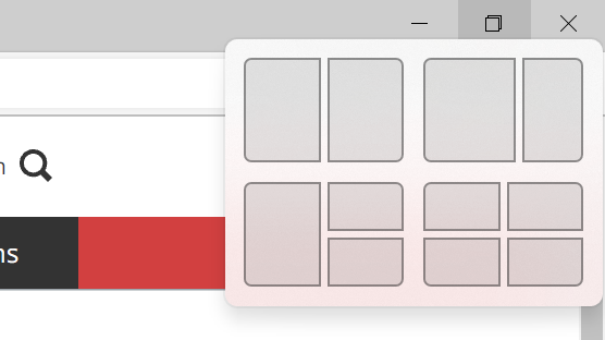
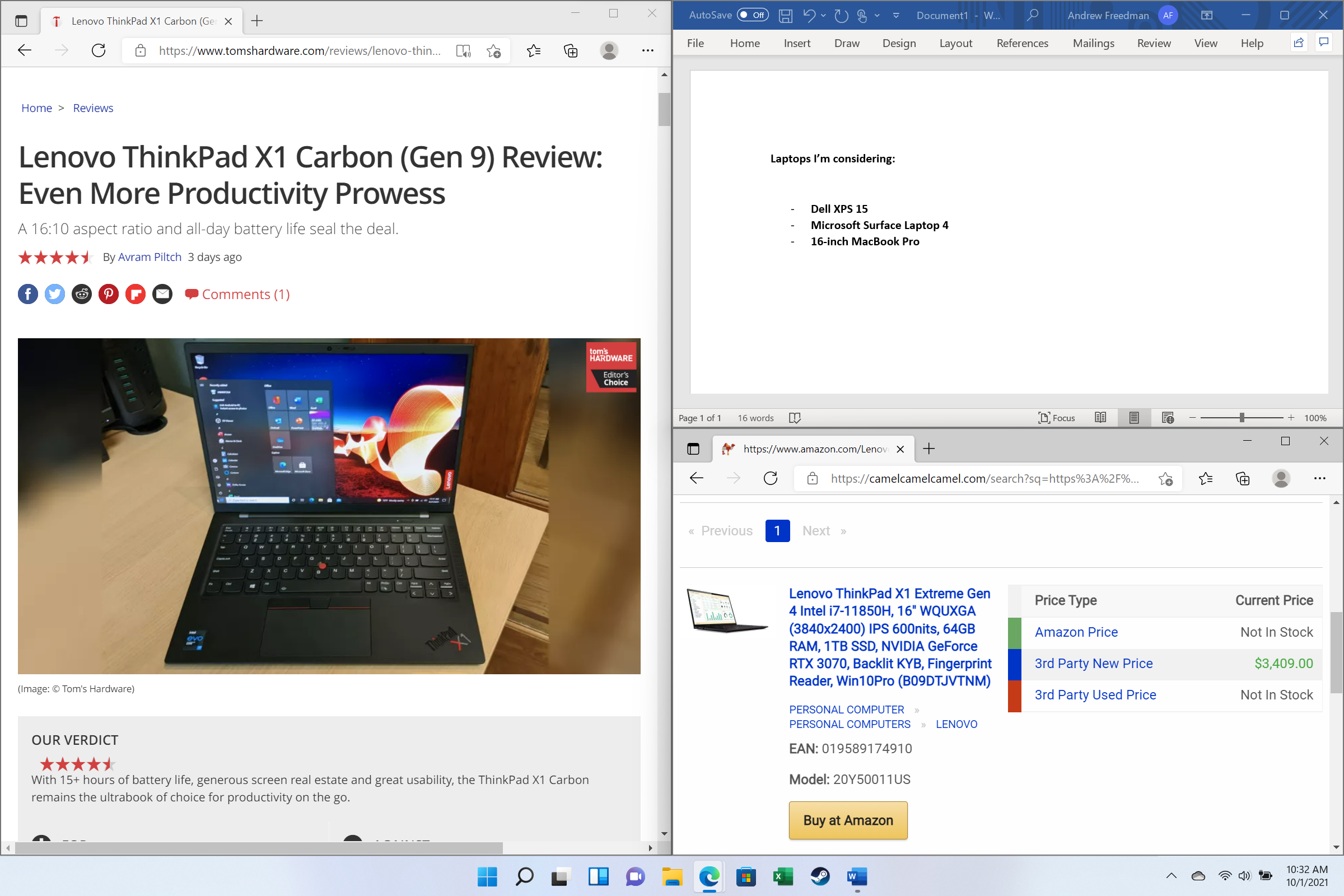
Hovering over the minimize or maximize button on the top right corner reveals a series of ways to organize your software on the desktop. It's how Apple does it in macOS, but far better (window management has always been better on Windows), and for those who prefer to move software around with the Windows + arrow keys shortcuts, those still work great.
Snap groups can also be accessed from the taskbar, which is a nice way to restore everything where you wanted it.
And if you want to switch between virtual desktops on one monitor, that's also easy. In fact, Microsoft has made this even easier in Windows 11 with a dedicated switcher on the taskbar, though the usual Windows + Control + arrow key commands still work, too. You can name virtual desktops, now, and even give them separate wallpapers.
If you move around between different rooms and a docking station, Windows 11 also finally remembers where everything lives when you're docked. This is another great usability feature. I've had some mixed success with this, but when it remembers everything, it's a breath of fresh air.
The Good Touch
Perhaps the biggest improvement in Windows 11 is how it handles touch. If you use a Windows tablet or 2-in-1, you'll see some benefits.
Some of the changes are small, like the way the Start Menu adds space between icons when you change to tablet mode.
But others make it easier to use. Microsoft's use of slightly opaque textures makes it extremely clear where you'll be dropping or snapping Windows when you drag them around. The touch keyboard has received a redesign, It allows for swiping in both full-width and detached modes and has a built-in GIF searcher. It brings back some great features from Windows 10, like holding the spacebar to move the cursor within text.
I'm not sure the keyboard will win over any new fans, but at least it has lots of custom themes. (my favorites are the ones that imitate the colors of Surface Type Covers.)
Additionally, swiping in from the left lets you view your widgets, while swiping from the right shows the calendar and your notifications.
And yes, I'll admit it, the new Start Menu feels good with touch, assuming you've pinned the apps you're going to use. In that way, it really just feels like using a phone.
It's not perfect for touch, especially when you get into some of the legacy parts of Windows. There's still a balance here where some things are better on desktop and some are better in touch. It's difficult to make something that caters to both, but this definitely feels more finger-friendly than ever before.
Microsoft's Open Store
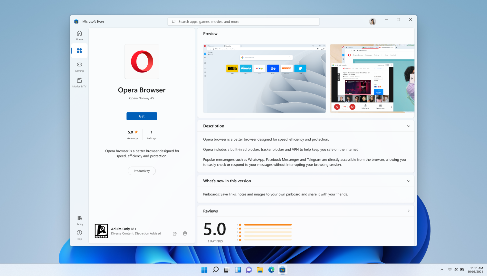
I can't say I know anyone personally who uses the Microsoft Store in Windows on a regular basis. But if people are going to use it, the Windows 11 store makes a fairly compelling argument.
Unless you're using Windows 11 in S Mode, you can still download software from other sources. But Microsoft is proving it's serious about the Store now. It has a redesign that makes it easy to use, and has already introduced a bunch of new apps, including PWA, UWP and Win32 formats. We've already seen additions like Disney+, Discord, Zoom, VLC and many others announced and starting to show up with the launch of Windows 11. Simply put, if the trend continues, this store will be more useful.
Android apps will come through Amazon's app store and,though that didn't make it for launch, Microsoft has said Insiders can expect to see this feature soon..
Microsoft is also accepting other stores onto its own store, such as Epic Games, while browsers are finally also joining. Opera and Yandex have already made the leap.
The Setup Process
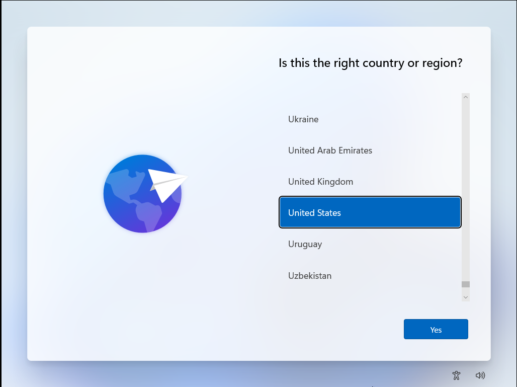
If you install Windows 11 in place of Windows 10, you won't see much in terms of setup. But for those buying new devices, Microsoft has streamlined the setup process and made it as pretty as the rest of the operating system. And, thank heavens, Cortana is no longer here to help. It has all of the language, keyboard options.
On laptops with IR cameras, Windows Hello is now built into the setup, which will likely encourage many who wouldn't previously dig through the settings to use it.
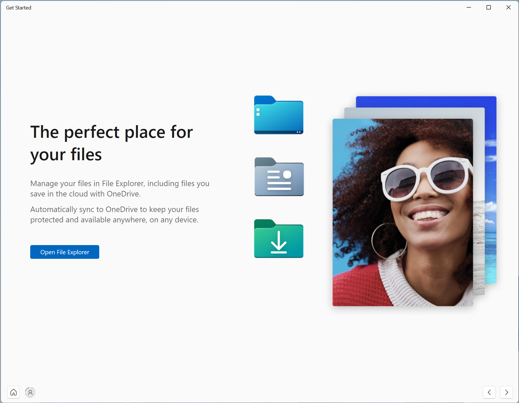
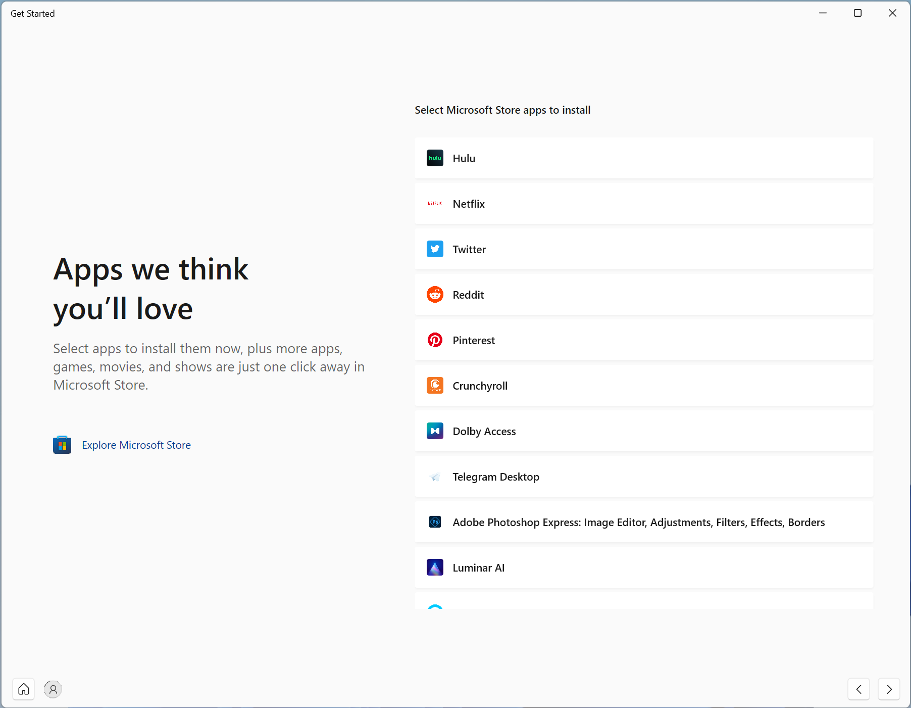
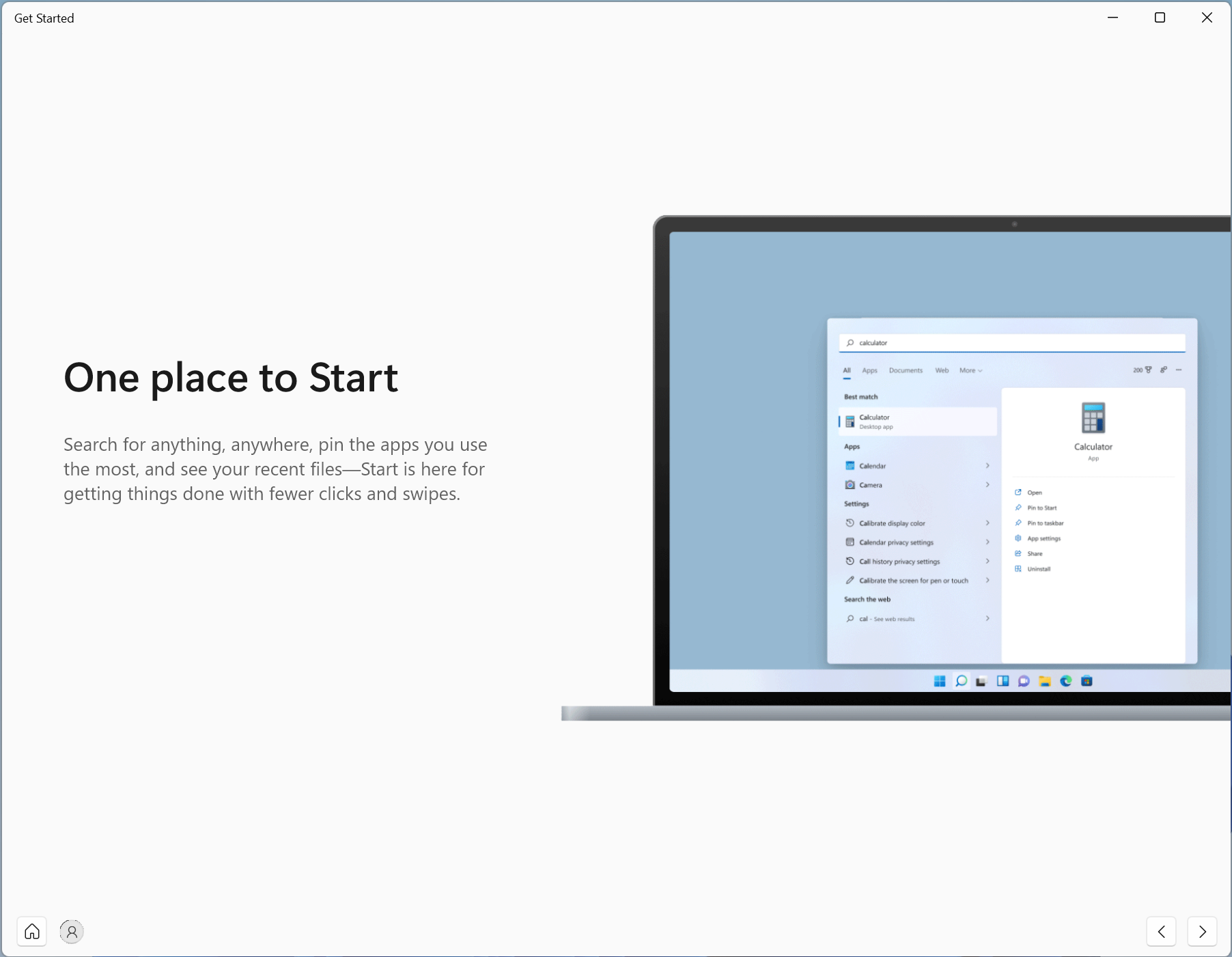
When you get into Windows 11 proper, there's an app called "Get Started" to provide further guidance. It feels like a bit much, considering how much Windows 11 is like Windows 10. This app guides you to the File Explorer and attempts to suggest apps that you should download from the Microsoft store, as well as showing you how the new Start Menu works and an advertisement for Microsoft Edge.
But one part of the setup process is a bit insidious...
New Internet and Account Requirements
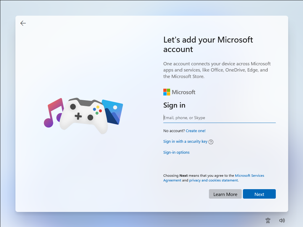
On Windows 10, there were ways around using the internet to complete setup. That's no longer the case, at least for Windows 11 Home. On the Home Edition, you'll need both to connect to the internet and sign in with a Microsoft account. Sure, this makes it easier to sync OneDrive files and, if you like your widgets, keep your customization options the same.
But it also feels a bit draconian. You haven't needed this account ever, and the justification for requiring it now, when it was always an option, feels like Microsoft demanding more information from its users. (Note that this isn't required for Windows 11 Pro.) That's not to say that it's not useful -- I had my account hooked up back in Windows 10, but it should be a choice, not a mandate. The internet requirement is particularly problematic in the large swaths of both the United States and the world where there’s not a reliable internet connection.
Windows 11 App Changes
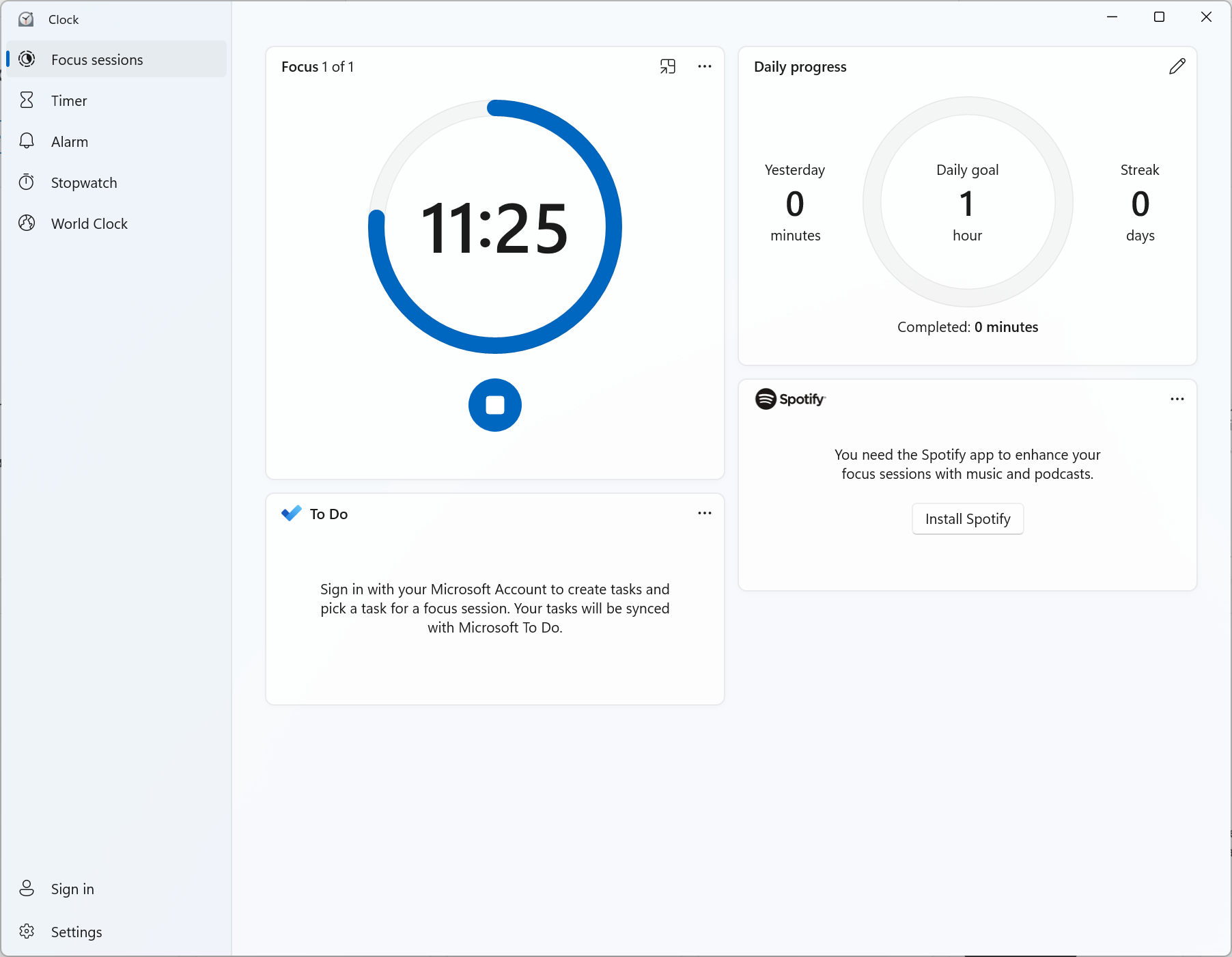
There are a few changes to apps you may be used to in Windows 11. Clock is the biggest right now, with the addition of "focus sessions," which encourages you to work for set periods of time with built in breaks. (Oddly, this doesn't seem to be at all tied into Microsoft's Focus Assist for notifications.) It even links to Spotify so that you can listen to music as you focus.
There are more changes coming, including in Paint and Photos, but those are still locked to Windows 11 Insider previews. We'll see more changes to Microsoft's own software to make it match the new Windows 11 aesthetic as updates come.
What to Look Forward To
Beyond Android apps, there's more we haven' seen yet. For instance, Xbox's DirectStorage will make its way to Windows 11, though we'll have to see games take advantage to greatly reduce loading times. Some other features that had been previously announced, like a universal mute feature and updates to apps like Paint also aren't available just yet. It's unclear exactly when they'll be added.
There's also Intel's upcoming Alder Lake processors, which should work directly with Windows 11 to provide the scheduler more information about the chip, including power and thermals.
What if I can't upgrade?
If you have compatible hardware, you may not be immediately served the update. Microsoft has previously stated that the rollout will start today and continue "into 2022." Microsoft's own Surface devices and OEM partners are likely to see the first wave of updates, ahead of custom built machines. In that case, you just have to wait it out or you can skip the line and force an update with Microsoft's official media installer.
Still, this update to Windows won't be applicable to a decent swath of PCs currently in use.
It's a bit of a doozy. Microsoft's system requirements for installing Windows 11 include a 1-GHz, dual-core CPU, 4GB of RAM, 64GB of storage, TPM 2.0, graphics that work with DirectX 12 and a 720p display that is greater than 9 inches diagonally.
In theory, that's pretty easy. But Microsoft is only supporting certain processors from AMD, Intel and Qualcomm. If you have AMD's first-gen Ryzen processors or anything earlier than some of Intel's 7th Gen CPUs, you'll likely be out of luck.
"Installing Windows 11 on a device that does not meet Windows 11 minimum system requirements is not recommended," John Cable, vice president of Windows servicing and delivery, told Tom's Hardware in a statement. "If a customer installs Windows 11 on a device that does not meet Windows 11 minimum system requirements, the device might malfunction due to compatibility or other issues. Devices where Windows 11 is installed that do not meet these system requirements will no longer be guaranteed to receive updates, including but not limited to security updates."
Microsoft suggests that all of this is to boost security across the PC ecosystem as well as ensure a stable experience running the operating system. It's a band-aid, the company is suggesting, that needs to be pulled off for a safer experience.
If you can't upgrade officially, there is a way to bypass Windows 11’s TPM check, and Microsoft even has its own instructions, but we wouldn’t necessarily recommend it as you may not get security or feature updates. Otherwise, you'll have to take solace that Microsoft is supporting Windows 10 through October 2025. By then, you'll want to consider purchasing or building a new computer if you haven't.
If you want to learn more, consider checking out Microsoft's PC Health Check app (warning, this link will download the application), which should let you know where you stand.
Bottom Line: Should I Upgrade to Windows 11?
If you're happy on Windows 10, Windows 11 doesn't feel like a must-have upgrade right now, especially if you're a desktop power user. If you're buying a new machine, you won't have much of a choice for long.
For every sleek, redesigned aspect and for every quality-of-life improvement, there's a step back. The changes to the taskbar and context menus are particularly egregious, reducing productivity at the worst of times.
I absolutely see the desire to streamline cruft in Windows 10, but in these areas, Microsoft is doing so at the expense of some long-time power users. Only those who use touch a lot, will benefit a ton from the initial launch.
Though you don’t have to upgrade from Windows 10 until 2025, Microsoft is more concerned with new computers. Soon enough, any new system will come preloaded with Windows 11 and, at some point, the new OS will be the default choice for people who build their own PCs.
There may be cases, as with Alder Lake processors that will have their scheduler built into Windows 11, where you'll need the new OS to get the best possible performance. We'll see how that plays out.
I see the potential in Windows 11. It's touch-friendly. It's modern with a store that, at the very least, has the capability of being friendly to both PC users and the developers making the software. I hope that Microsoft sees feedback about the changes that were overzealous (and potentially infantilizing) while continuing to modernize where it's appropriate.
If you're not a power user, you probably won't notice a ton of difference and may like the refreshing new design. But Windows' biggest fans are power users, so hopefully Microsoft is working on making sure they still feel at home.

Andrew E. Freedman is a senior editor at Tom's Hardware focusing on laptops, desktops and gaming. He also keeps up with the latest news. A lover of all things gaming and tech, his previous work has shown up in Tom's Guide, Laptop Mag, Kotaku, PCMag and Complex, among others. Follow him on Threads @FreedmanAE and BlueSky @andrewfreedman.net. You can send him tips on Signal: andrewfreedman.01
-
hotaru.hino Reply
Nah, the only version out of the box that was "perfect" was 7. And it was only "perfect" because it was really just Windows Vista SP2 with a shiny new taskbar and some other under the hood features that got backported to Vista.Jake Hall said:Predictable Microsoft. Every other OS is junk -
Alvar "Miles" Udell The question becomes how heavy handed will Microsoft be at attempting to force Windows 11 onto Windows 10 users. Something tells me they won't learn from their GWX fiasco and I'll bet they start pushing, at a minimum, nag screens and nag prompts onto Windows 10 users as soon as Windows 2H21 is released.Reply -
Alvar "Miles" Udell Replyhotaru.hino said:Nah, the only version out of the box that was "perfect" was 7. And it was only "perfect" because it was really just Windows Vista SP2 with a shiny new taskbar and some other under the hood features that got backported to Vista.
Disagree. Windows 2000, in my experience, was rock solid from the start because it was so stripped down with a focus on stability. -
Jake Hall Windows 2000: 👍Reply
Windows ME: 👎
Windows XP:👍
Windows Vista: 👎
Windows 7: 👍👍👍
Windows 8:👎
Windows 10:👍
I'm gonna wait for Windows 12 LOL -
USAFRet Reply
Anyone that gives XP a thumbs up is looking through rose colored glasses.Jake Hall said:Windows 2000: 👍
Windows ME: 👎
Windows XP:👍
Windows Vista: 👎
Windows 7: 👍👍👍
Windows 8:👎
Windows 10:👍
I'm gonna wait for Windows 12 LOL
You forget the total ridicule for the interface when we first saw it onscreen.
It wasn't until SP2 that it was actually usable and stable. -
hotaru.hino Reply
Considering Wikipedia lists mostly features added to it (and it's a lot of features), doesn't seem to list any notable features removed, and the fact it had four service packs, I'm going to have to disagree with it was "stripped down for stability"Alvar Miles Udell said:Disagree. Windows 2000, in my experience, was rock solid from the start because it was so stripped down with a focus on stability.
I mean compared to its "home version" Windows Me, it was certainly rock solid. -
randomizer ReplyMicrosoft has already committed to supporting Windows 10 through October 14, 2025.
Microsoft's support committments aren't worth much after Microsoft decided to stop supporting hardware on Windows 8.1 that was previously supported, and during the mainstream support period too. -
USAFRet Reply
"Better than WinMe" is a very low bar to pass.hotaru.hino said:I mean compared to its "home version" Windows Me, it was certainly rock solid.
